Our Museum
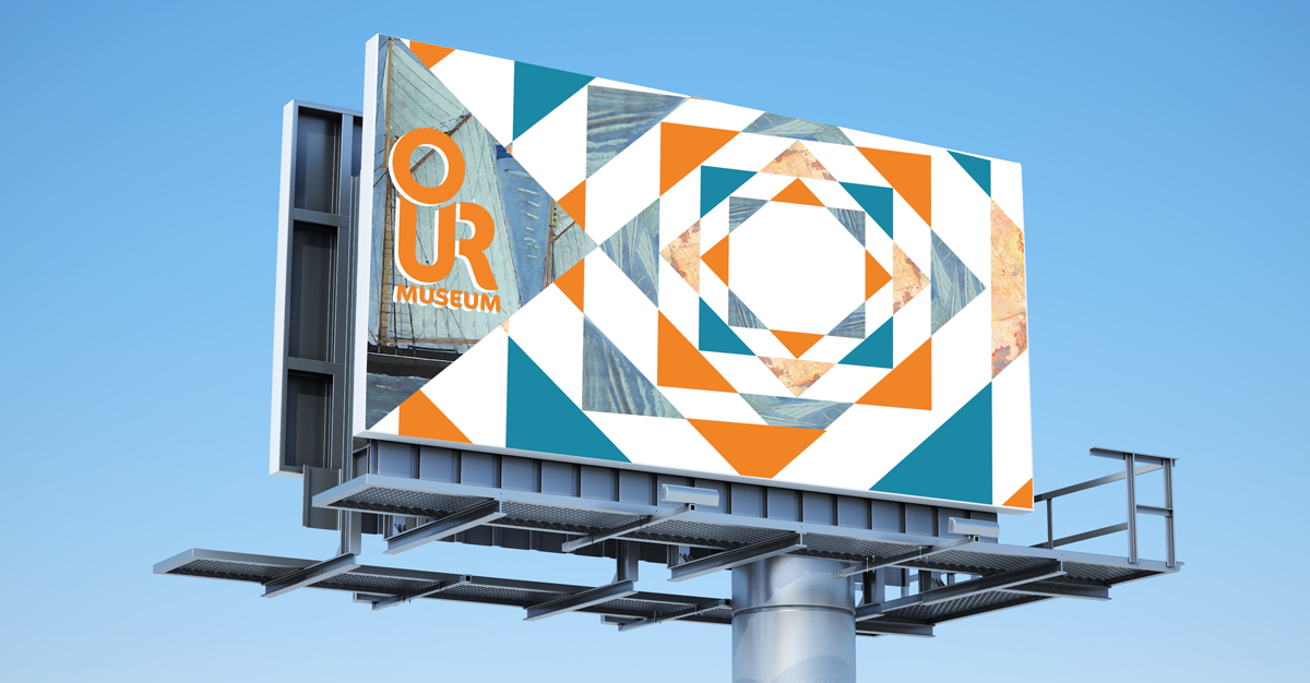
Brief
The Our Museum project is to create an inclusive, cultural and communal hub, bringing the museum to life.
Branding Project
Our Museum
Our Museum is...
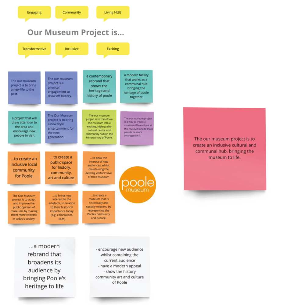
Introductrion
For this project, it was important to create a successful rebrand for Our Museum. They wanted it to be suitable for a wide target audience. It was important for the branding to bring Poole community together and inspire people to visit the museum. Research, Typography, layout, colour and delivery where all crucial factors to making this project successful. Every decision made had to link back to our brief and target audience to ensure the Our Museum client and the public liked the branding.
Communication
Due to the pandemic this made communication a challenge at first. As a team we used Miro, it allowed us to share ideas and any development to ensure we made decisions as a team.
Collection
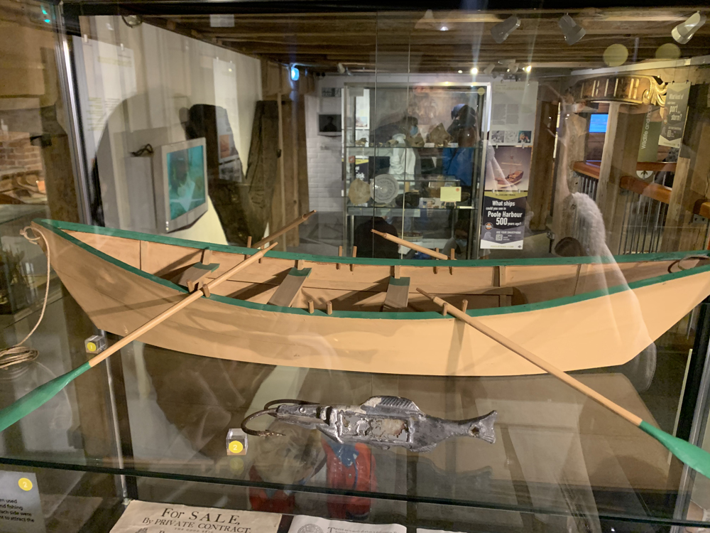
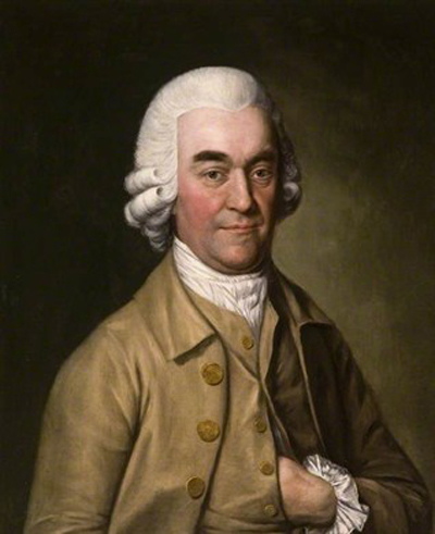
About the Artifacts
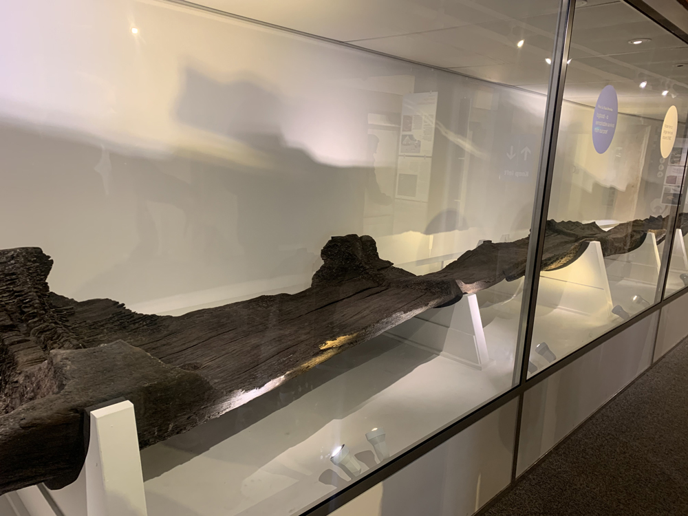
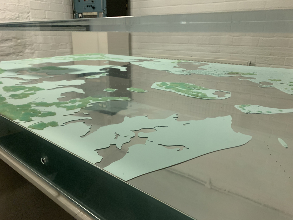
The Museum also holds a range of adjacent social history, ceramics, Fine Art, natural history and photography collections, elements of which are of national significance.
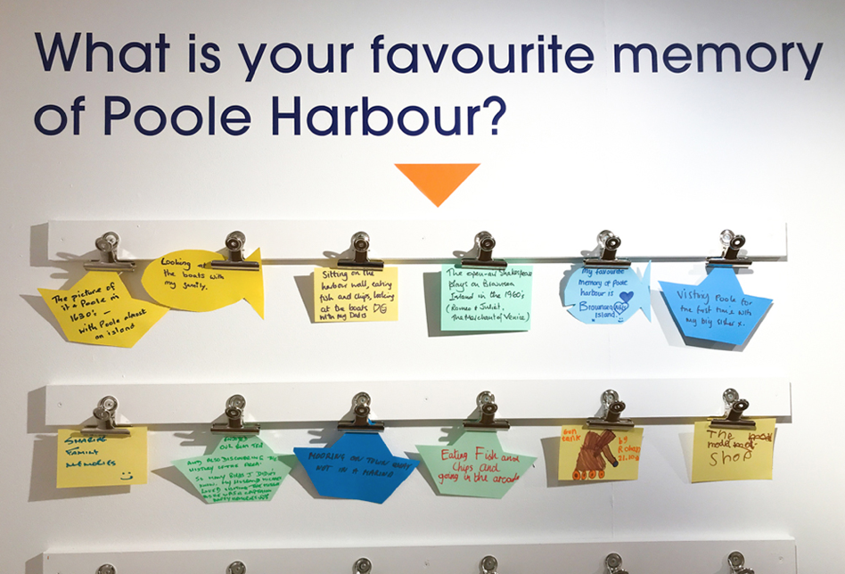
Visiting The Museum
To get a better insight into how our logo and branding would be displayed, we visited Poole Museum. Initially, we noticed that there was no existing community aspect to the museum. The project lab was the main area of focus for us as it showed examples of community engagement, which we wanted to encourage with our brand.
Looking around the museum, we were very interested in incorporating some of the displayed artefacts into our project for branding and touchpoints. Therefore, we wanted to create a logo which would work seamlessly with those artefacts.
Moodboards
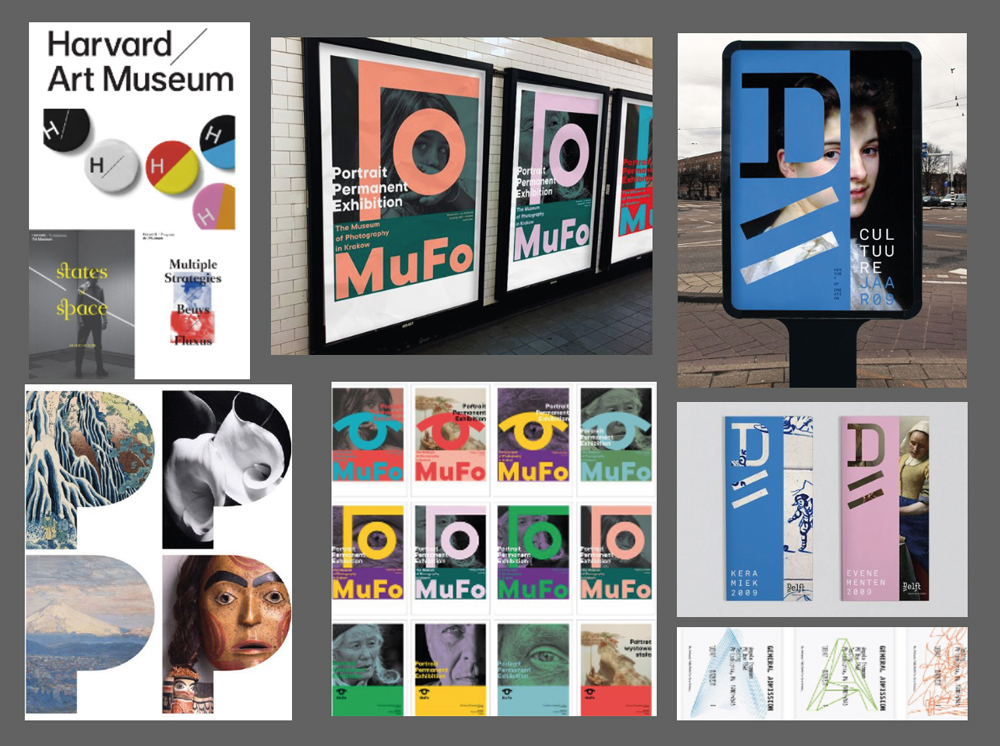
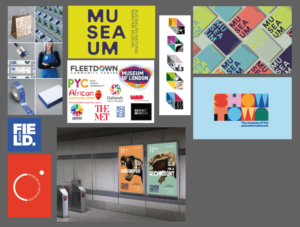
Logo Development
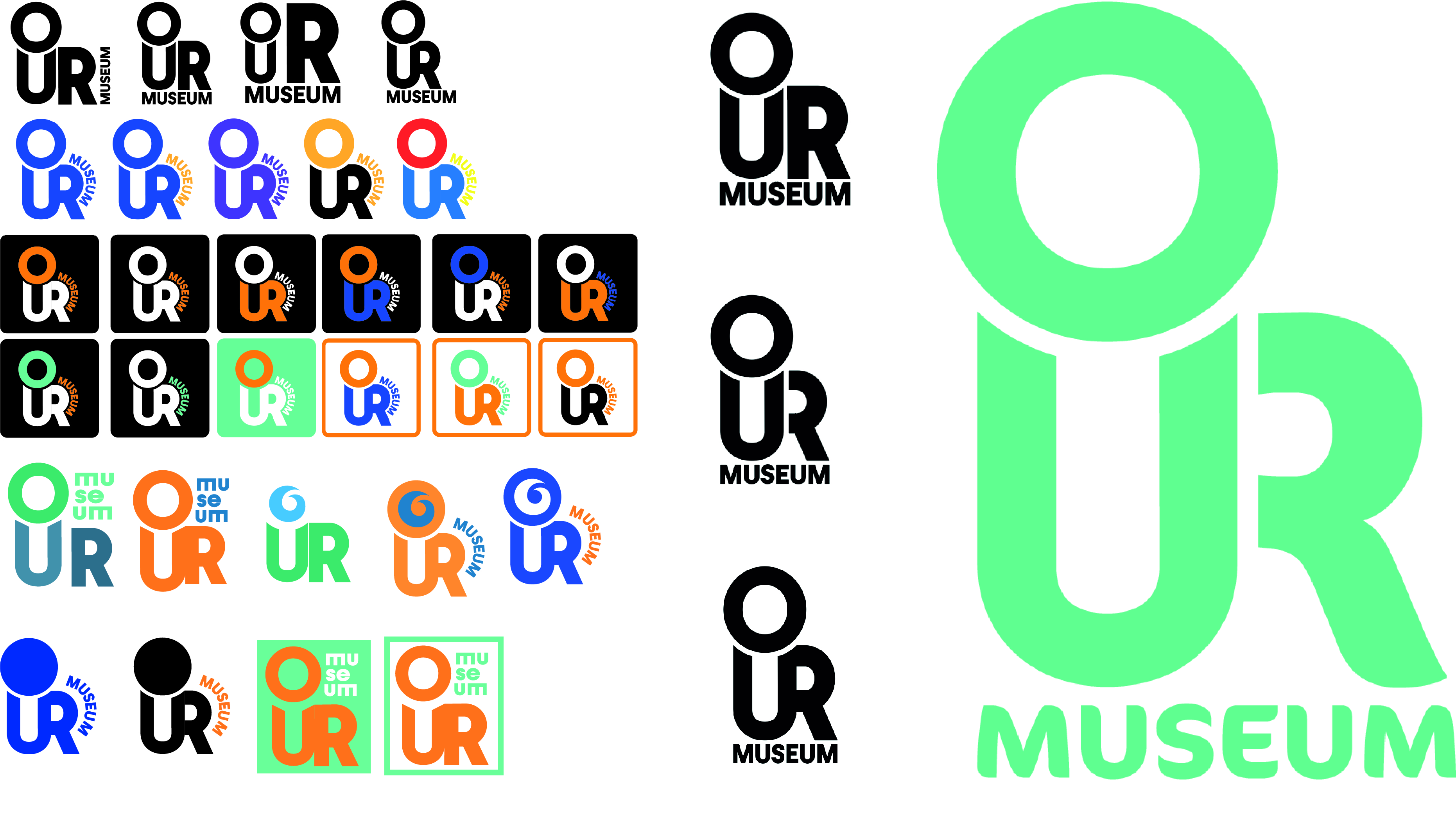
Coming Up with a Logo
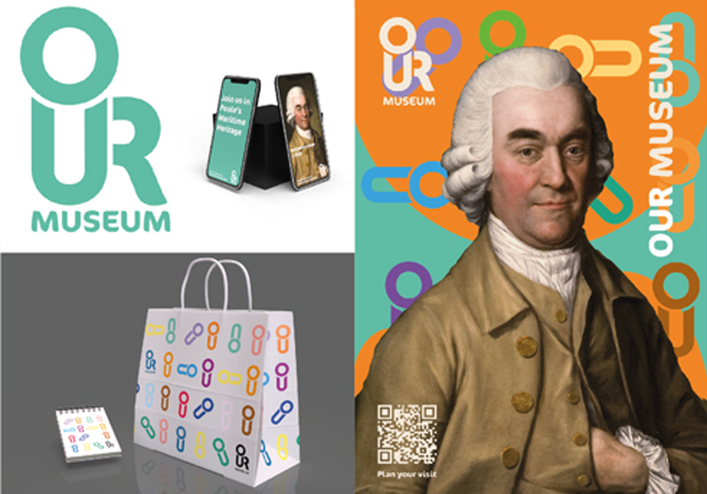
The idea of this logo came from playing around with the word ‘our’. We wanted to strongly communicate the importance of community and culture in the logo which is why we made the letter forms look similar to a human figure.
We played around with various styles and colours to see what would work best for our final logo. As well as experimenting with diffrent type and shapes.
Colour Palette
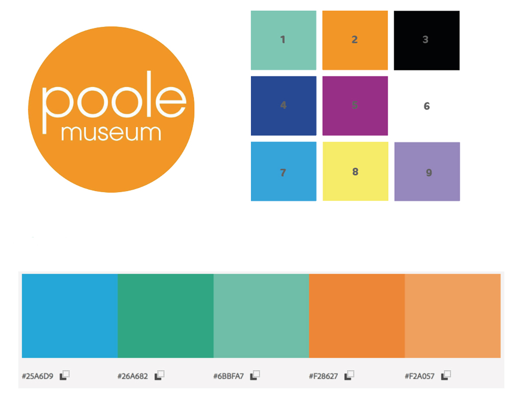
Final Colour Decision
Poole Museum’s logo is a bright orange which contrasted well with the colour scheme we picked. We extracted the colour from Poole Museum’s logo on Adobe Colour to come up with our colour scheme.
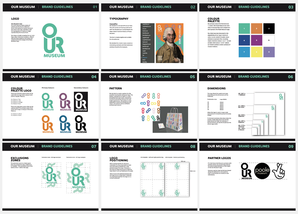
Our primary colours for the brand are 1, 2 and 3. We chose these as our main colours because they both compliment and represent the Poole Museum logo.
Our client was also interested in the adaptability of our logo in terms of colour so we created a broader colour scheme to represent this. Including classic maritime colours - 4, 6, 7 - as well as bold, vivid colours - 5, 8, 9 - allows our brand to attract a wider audience of museum visitors.
Poster Development
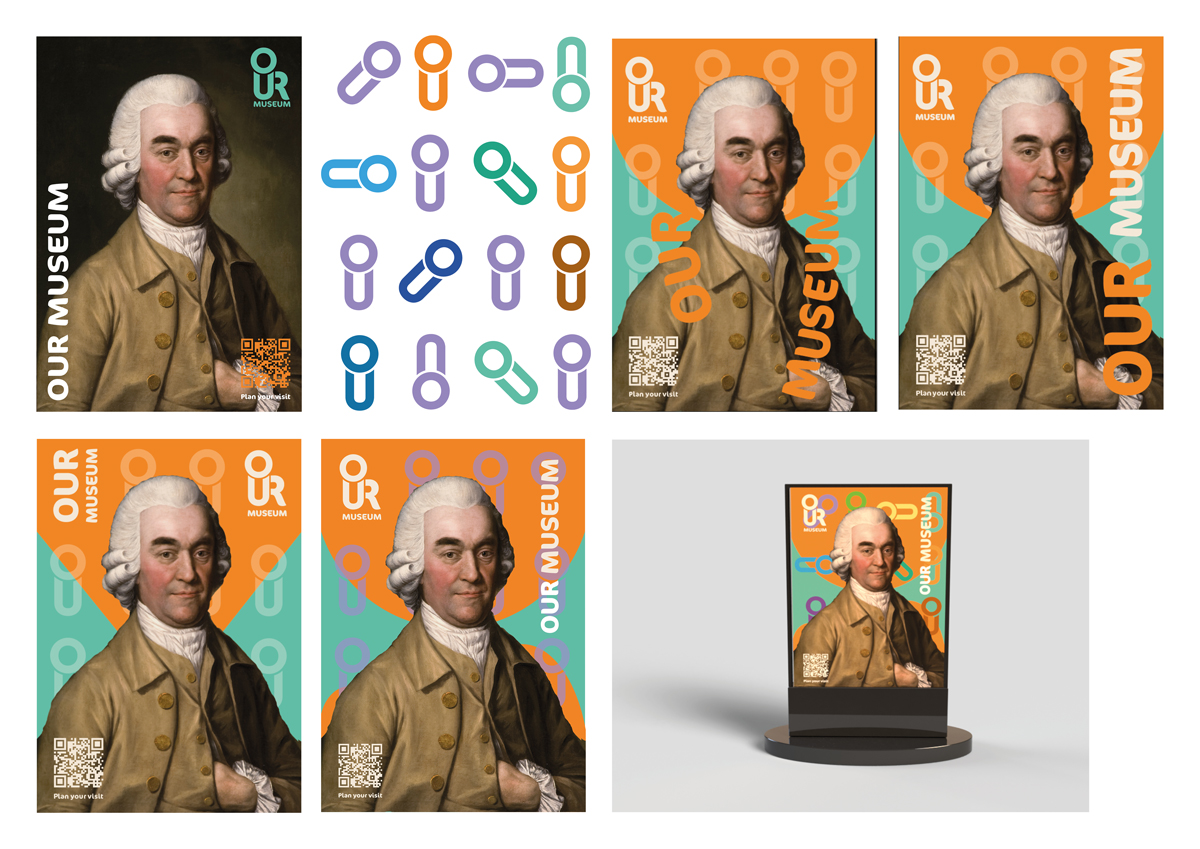
Designing a Poster
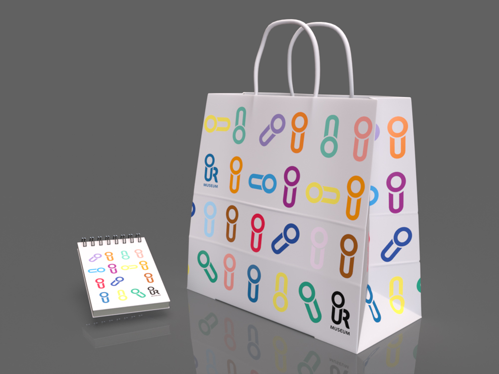
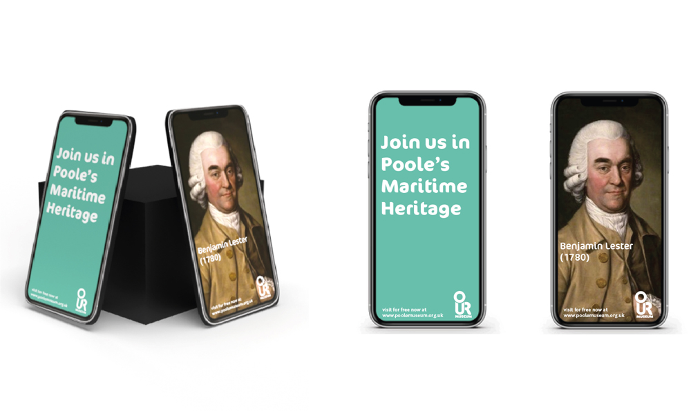
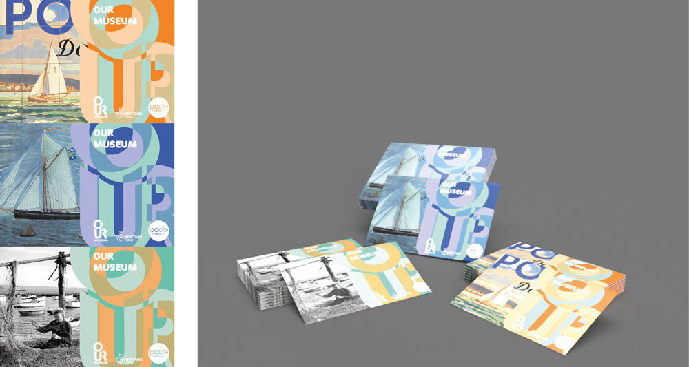
We knew the museum wanted a more contemporary feel to the museum. We achieved this through vibrant colours and a more modern layout. The designs are legible on all touch-points.
Pathways
Choosing a Pathway
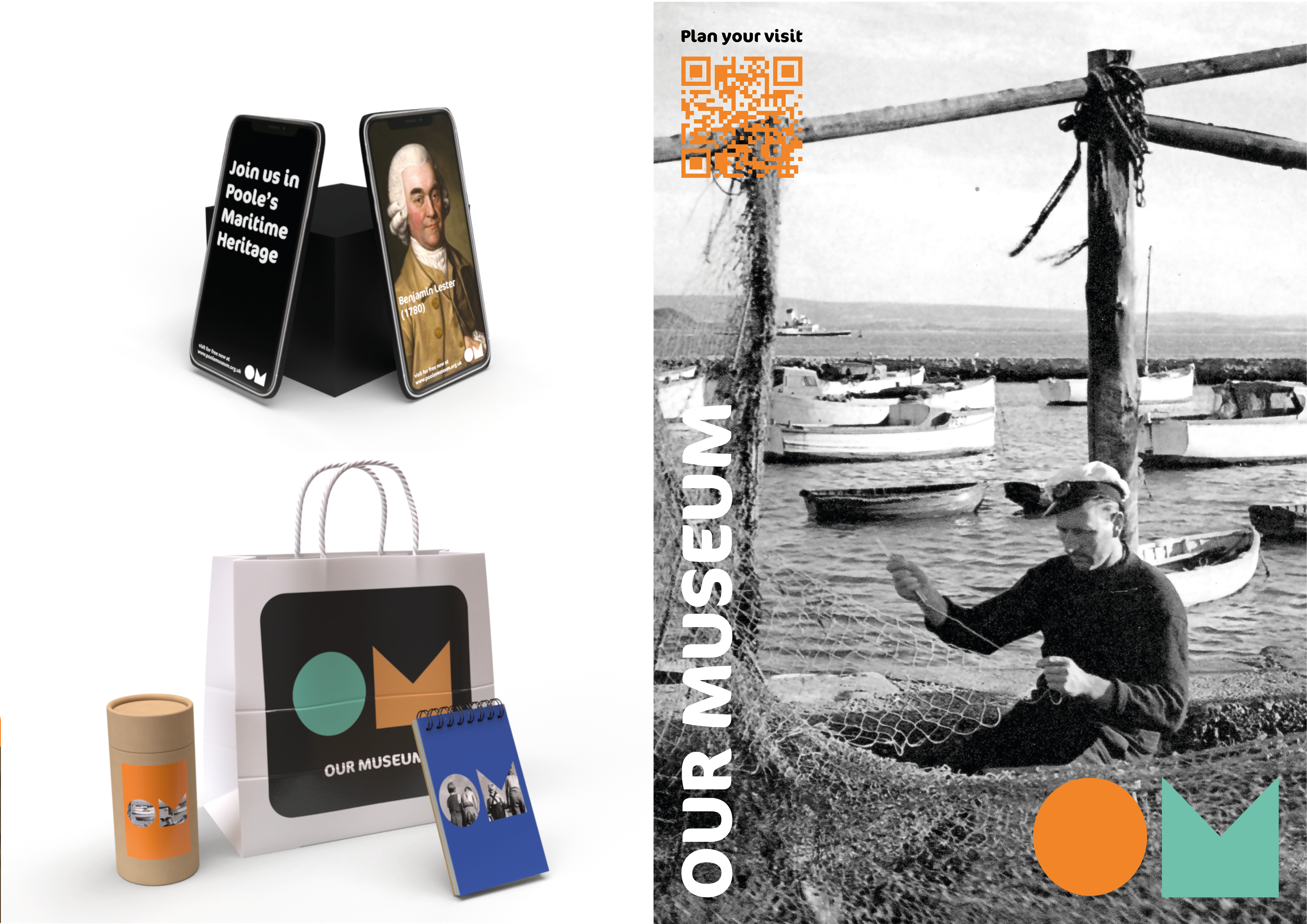
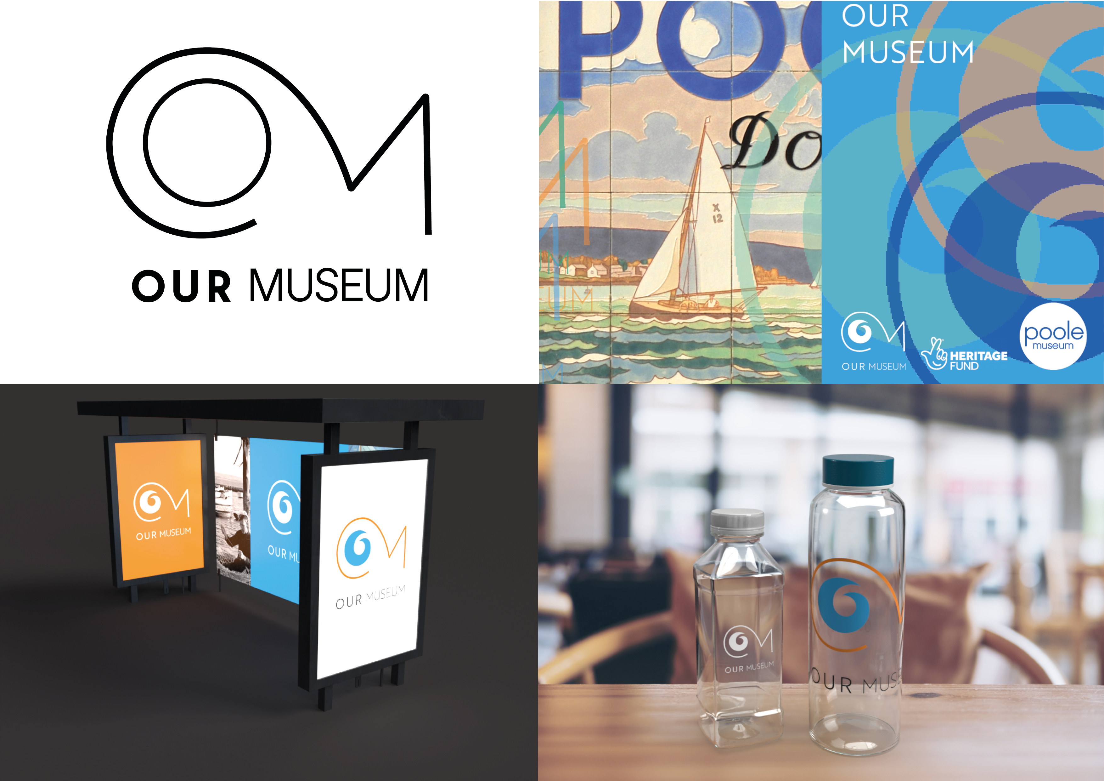
These are the different pathways we presented to the client. We wanted to come up with three as it gives the client options. After presenting to the client, peers and tutors it was decided that pathway one was the most successful, this was great for us as a team because pathway one was our favourite. We felt it met the brief the most and had the most potential.
Guidelines
Our Brand Guidelines
Having brand guidelines insured we kept the brand consistent and recognisable. This helped the brand look more professional. Additionally, the brand guidelines helped me design my process book for this project.
Animatics
Being Shortlisted
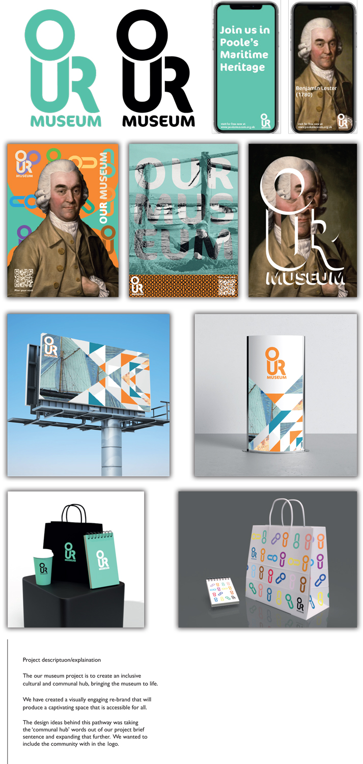
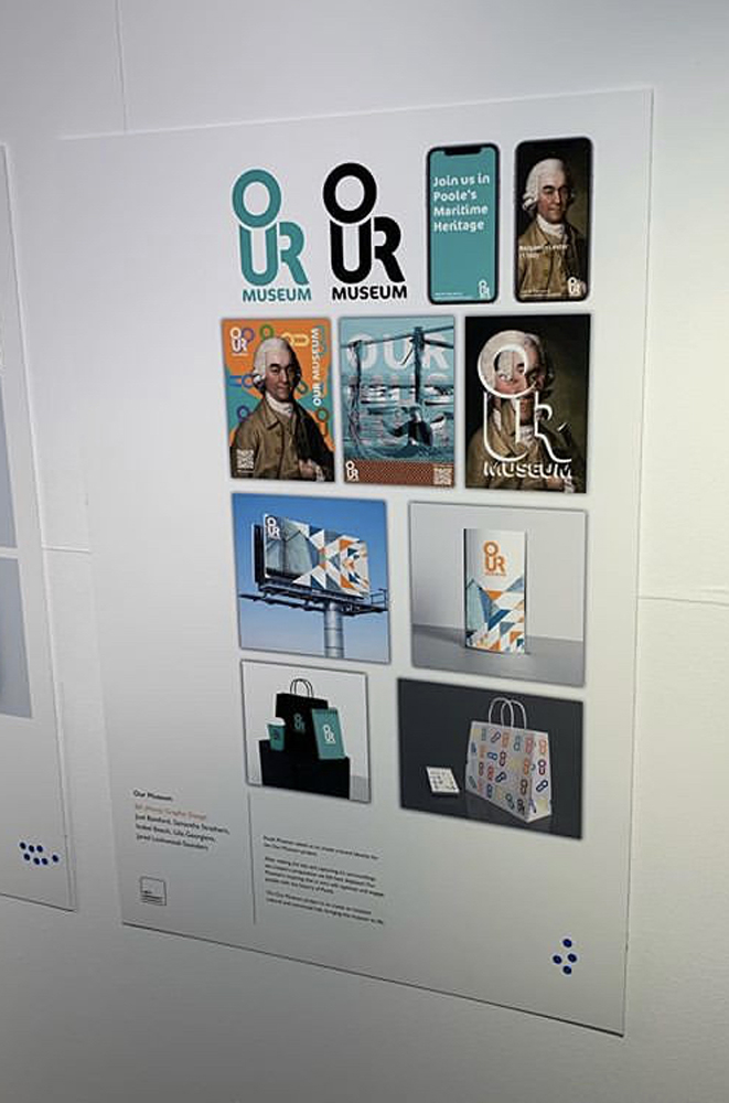
Our Museum Shortlisting Our Team
Being short-listed was extremely exciting for team futura. It taught me to have more confidence In my design which will help enhance my projects in the future, especially when presenting my work to peers, tutors and clients. However, our design didn’t get voted by the public which conveys more research on target audience’s needs to be done in order to make the design more successful.
Delivery
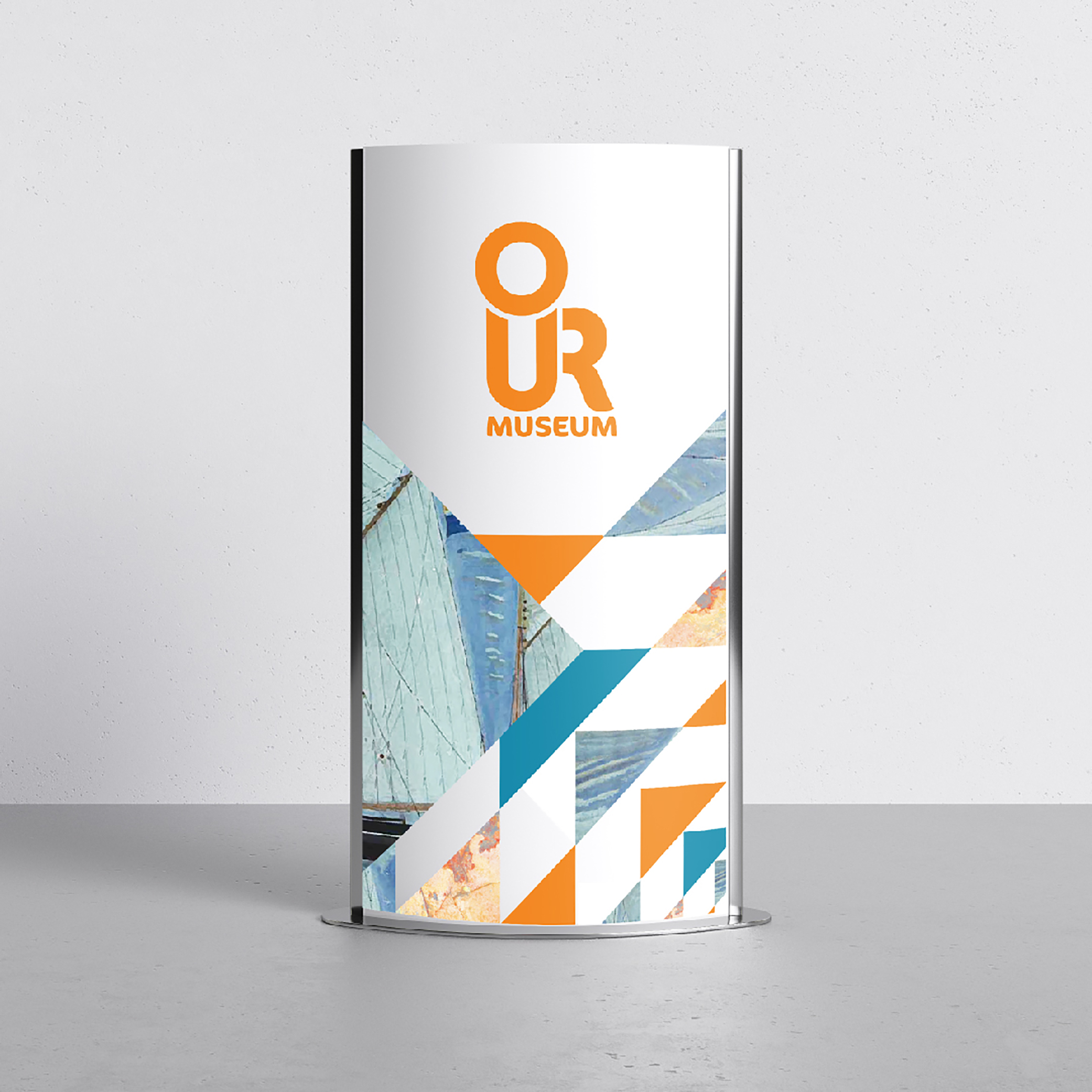
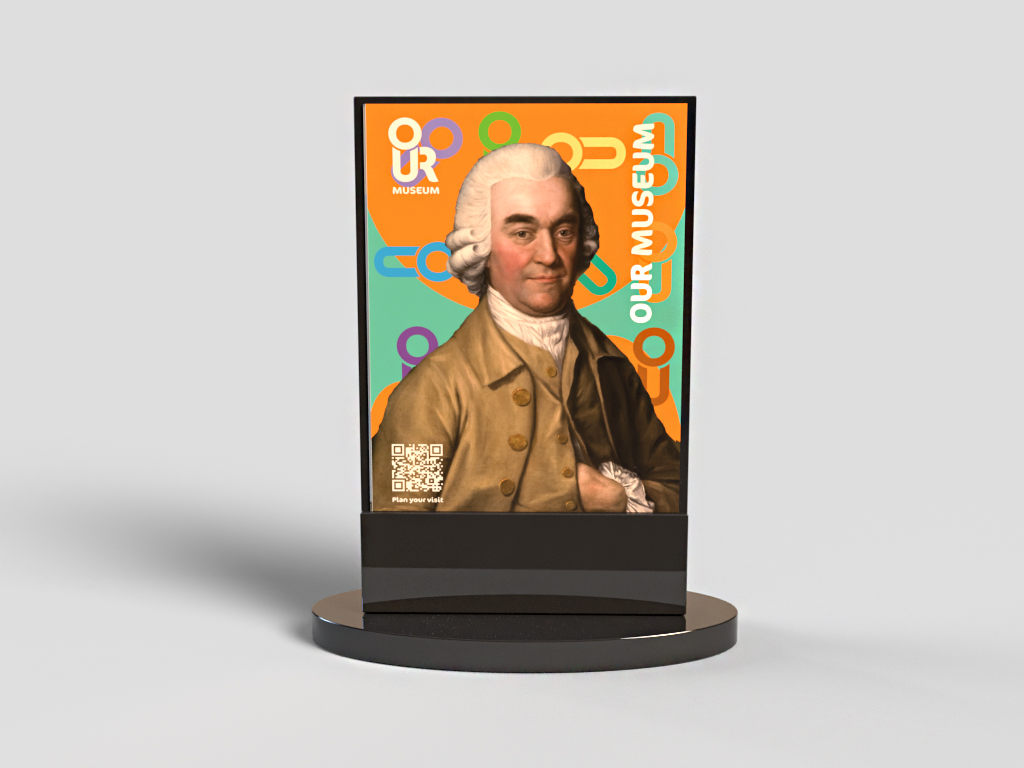
Process Book
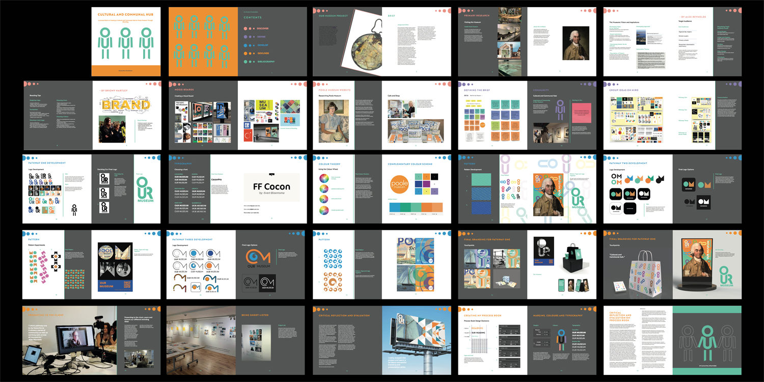
The ‘Our Museum’ project showed strengths and weaknesses. With the project, only being 3 weeks, it was hard to adapt to working at a fast pace, although this was a challenge it made me push myself into creating ideas quickly and learning to be confident with what we created. As a group, we could use our individual strengths to an advantage which helped making it a successful project. Personally, I was successful with creating posters and touch-points that helped bring the brand to life, helping the client get a better understanding. I also put a lot of research into typography and colour helping our brand flow.
I found the project exciting and challenging, helping me develop my knowledge and skills on Graphic design. After presenting to the client, peers and tutors, it made me understand the importance of words and how you deliver them, this is something I felt as a group we struggled with due to not spending enough time planning what we want to say and how we deliver it. Watching other presentations helped my understanding on how to deliver a successful presentation.
Additionally, more time would have allowed for more research which would have helped strengthen our project it would additionally have allowed us to make any changes to our designs after we got feedback.
The work we produced was successful and matched our brief, ‘Our Museum project is to create an inclusive cultural and communal hub, bringing the museum to life.’ The use of colour helped bring a contemporary feel to the museum and made it more of an inviting place to visit instead of sticking to a very limited colour scheme. The main logo for pathway one was a cool turquoise which complimented their current logo they have for Poole museum which is orange. Furthermore, the type we used ‘CoconPro’ worked well for the museum as it uses soft curves which matches the maritime theme the museum has. Most the feedback was positive and they found the logo successful as it.
I felt we explored a wide variety of ideas having three different pathways that are all different where in the end the client chose pathway one which we also felt as a group that it is our most successful pathway.
• Design Week (2018). How the Horniman’s new gallery reveals the human stories behind objects [online]. Available from: https://www. designweek.co.uk/issues/9-15-july-2018/how-the-hornimans-new- gallery-reveals-the-human-stories-behind-3000-objects/ [Accessed 3 December 2020].
• Expertise, Work, do, W. we, People, Thinking, N.&, Contact, Policy, P., Policy, E., Policy, P. and Policy, E. (n.d.). Museum of London Branding - Global Branding Agency [online]. Available from: https://www. coleyporterbell.com/case_study/museum-of-london/ [Accessed 3 December 2020].
• Long, M. (2020). Showtown: Blackpool’s rst museum inspired by “joy and whimsy” of town [online]. Available from: https://www. designweek.co.uk/issues/6-12-january-2020/showtown-blackpool- branding/ [Accessed 3 December 2020].
• Mindsparkle Mag (2018). MUSEAUM Corporate Design [online]. Available from: https://mindsparklemag.com/design/museaum- corporate-design/ [Accessed 3 December 2020].
• Pinterest (n.d.). Harvard museum branding on merchandise, really interesting to see the simple logo/type presented on the ... | Museum branding, Merchandise design, Typography branding [online]. Available from: https://www.pinterest.ca/ pin/123849058477648232/ [Accessed 3 December 2020].
• Poolemuseum.org.uk (2014). Home | Poole Museum | History of Poole | Poole Heritage | Maritime Museum [online]. Available from: http://www.poolemuseum.org.uk.
• studiodumbar.com (n.d.). Delft City Marketing [online]. Available from: https://studiodumbar.com/work/delft-city-marketing [Accessed 3 December 2020].
• World Brand Design (2020). MuFo—Naming and Visual Identity of the Museum of Photography in Krakow [online]. Available from: https:// worldbranddesign.com/mufo-naming-and-visual-identity-of-the- museum-of-photography-in-krakow/ [Accessed 3 December 2020].
• www.dandad.org (n.d.). Window into the World | Leo Burnett Chicago | Field Museum | D&AD Awards 2019 Shortlist | Brand Refresh | D&AD [online]. Available from: https://www.dandad.org/awards/ professional/2019/branding/231241/brand-identity-window-into- the-world/ [Accessed 3 December 2020].
• www.itsnicethat.com (n.d.). North reveals full Science Museum rebrand, and reacts to online criticism [online]. Available from: https://www.itsnicethat.com/news/north-science-museum- rebrand-identity-graphic-design-111017 [Accessed 3 December 2020].