Wayfinding
Brief
In this assignment I was required to collaborate with an Interior Architecture student and create and design a wayfinding system for a homeless hostel & rehabilitation Centre.
Visual Systems
Wayfinding for a Homeless Shelter
Care In The Community
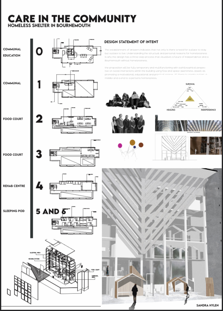
Sandran Hylen's Design Statement of Intent
“The establishment of answers indicates that not only is there a need for a place to stay but a place to live. Understanding the structual and personal reasons for homelessness is why the design has a three step process that visualises a future of independence and a Bournemouth without homelessness.
The proposition will be fully temporary and multifunctioning with a philosphical pespective on social interactions within the building using flow and space awarness, aswell as promoting a motivational, educational and practical space.”
Main Points We took
‘Not only a place to stay but a place to live.’ -This suggested to us that the place should feel homely and welcoming.
‘A three step process that visualises a future of independence.’ -The building is a process to help homeless people become independent.
‘Fully temporary and multi-functioning.’
‘Promoting a motivational, educational and practical space.’ -The design has to work with the space wanting to feel motivational.
Concept
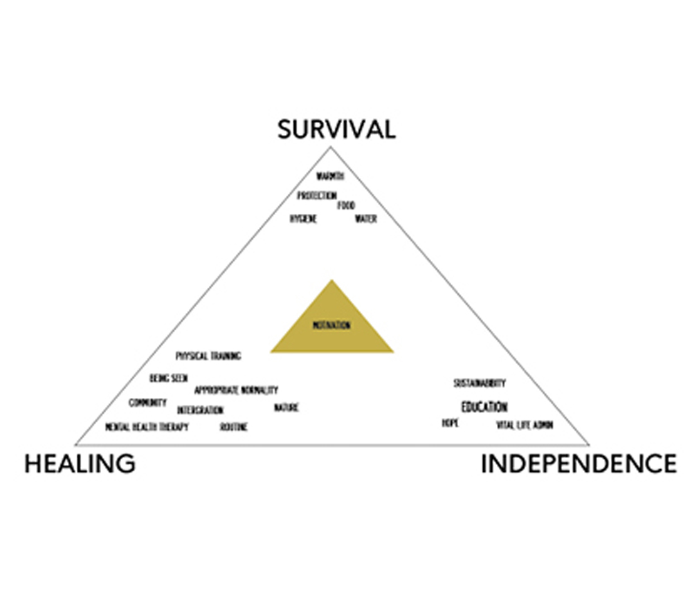
Survival, Healing and Independence
We wanted to add a design that represented motivation, healing and independence. This is how we came up with a mountain. Mountains evoke a special sense of awe and power and no single image or meaning can capture or express every facet of its symbolic significance. It can also represent a process and a challenge which can help motivate individuals.
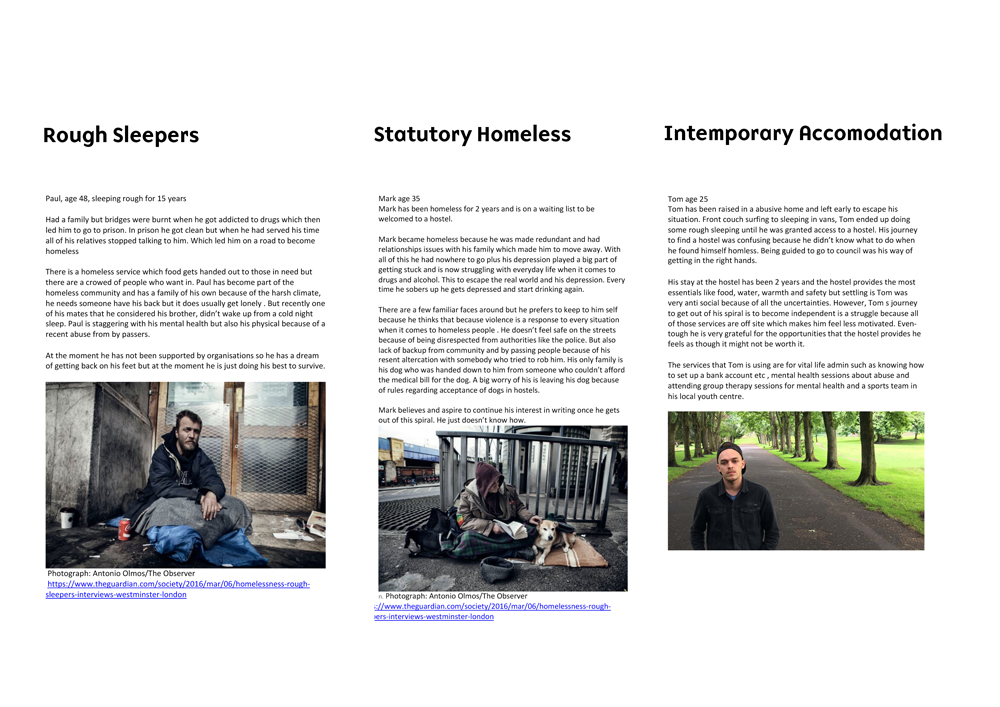
User Types
Generating Ideas
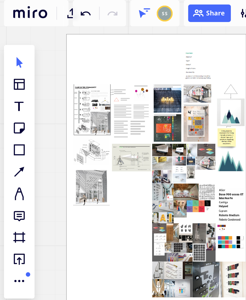
Using Miro for Generating Ideas
Due to COVID this meant communication between our team was going to be a challenge. These are some of the platforms we used to communicate to each-other regularly. Miro was a really helpful tool that we used a lot as we could discuss our ideas and upload any helpful images or designs we’ve done. This helped us come up with a strong concept and bring our ideas to life.
Colour Palette
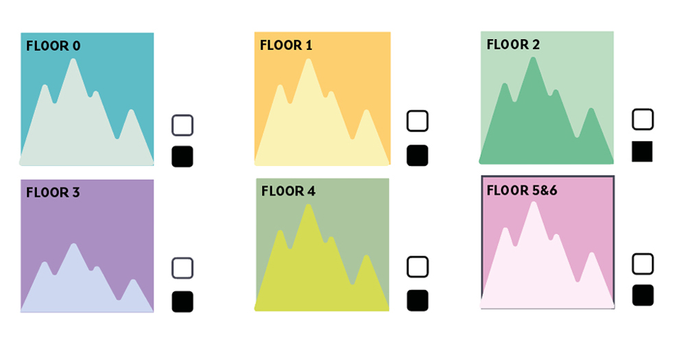
Using a Bright Colour Palette
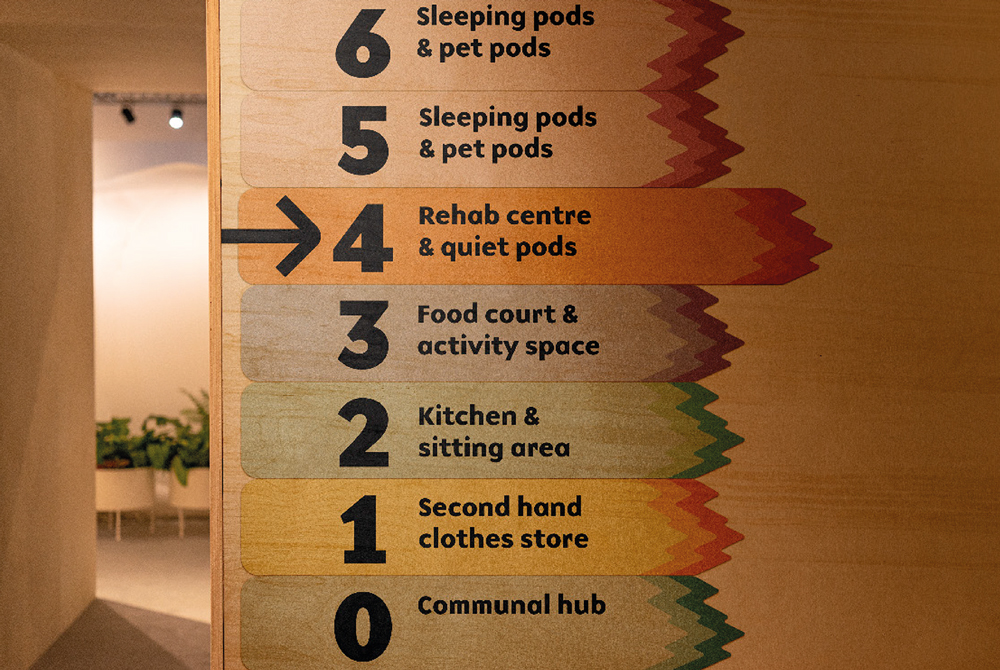
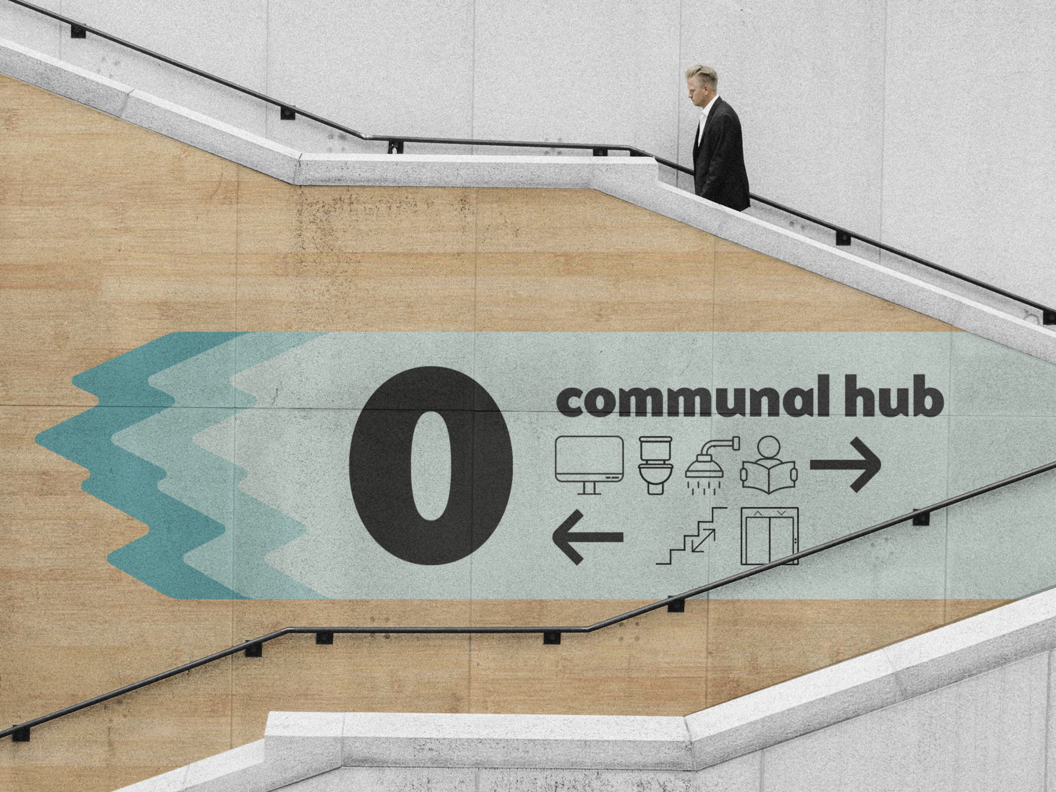
We chose a different colour scheme for each floor so users can easily know where they are by telling floors apart. We used a lot of positive colours to keep the spaces feeling happy and welcoming. We felt having a limited colour scheme could feel a bit too corporate and intimidating which we wanted to avoid. On each floor we used more of a subtle colour for any design and the bright colours for important signage to make it clear to all users.
Final Logo
Logo for Zenith House
For our final logo I wanted to represent Sandra’s idea of a 3 step process of getting out of homelessness. This is why I decided to place the 3 mountains together with the name of our building underneath. This logo is easily recognisable and simple. The light green in the colour represents calmness and saftey.
Workshops
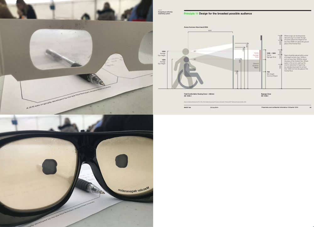
Visual Impairment Workshop
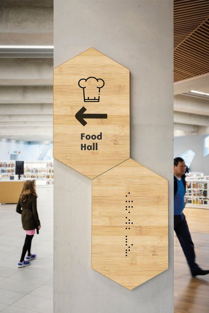
When designing for our way-finding it is important to consider all design aspects to work for all users. This can be done through large font size to help people with limited eyesight so see, also considering Braille on signage. Additionally its important our signs are at a level where all users can see it clearly. Additionally, it’s important to think about colour and consider what will stand out the most. Using the glasses taught us that glare, colour and size is really important to help way-finding stand out. ‘Any wayfinding solution must to be people-centred, taking into account the user at every stage. By combining sciences like communication studies, ergonomics, psychology, semiotics, and sociology, with empathy and design sensitivity, we are able to create unique wayfinding strategies and designs which meets the unique needs of each user – no matter what the brand, environment or context.’ -(www.integrity.co.uk, n.d.)
Sustainability
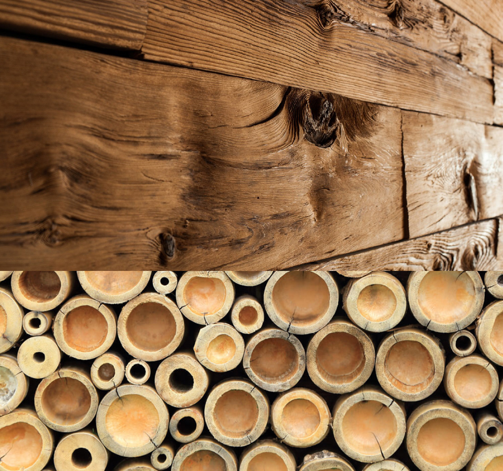
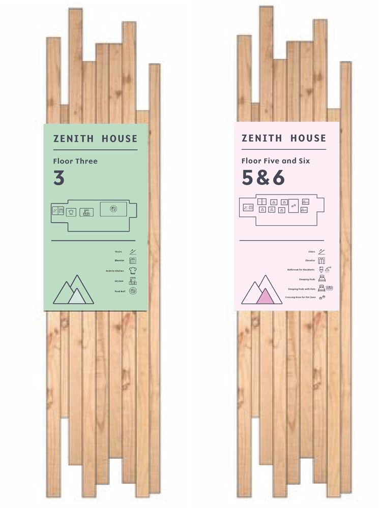
Using Recycled Wood
During this project George and I did a lot of research in different materials to use for our wayfinding design. With sustainability being incredibly important to us we knew there was no excuse not to use materials that where sustainable. We looked into recycled materials. We came to a conclusion that either recycled wood an bamboo would be used for our wayfinding, not only is it most sustainable it also helped give our wayfinding a welcoming, cosy and warm feel, this was important to Sandra as she mentioned she wanted the space to feel open and welcoming which is why any hard manufactured material would have been inapropriate. Furthermore, Sandra’s space is temporary and multifunctioning meaning the wood can keep being recycled and reused to limit any waste.
Floor Plans
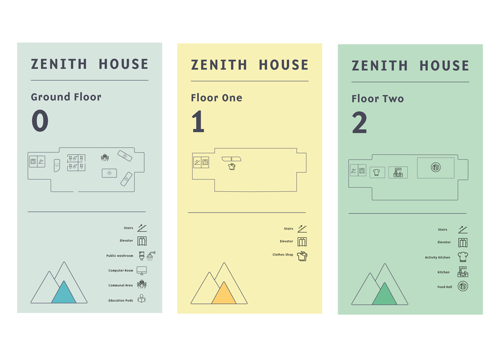
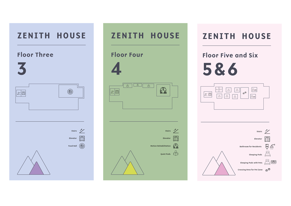
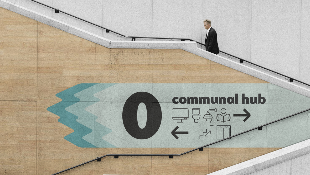
Floor Plans 0,,1,2
This was my final outcome of the floor plans. I decided to simplify them down to make them most legible for the users. We coded it using our icons which is much easier to understand rather than using a numbered system. The font is clear and bold to stand out. Furthermore, i decided to take out any patterns from the back ground and over powering colours as I felt it took focus of the wayfinding.
Delivery
Presentation
The way-finding project collaboration with architecture had its challenges but also had it’s successes. For this project communication, design and timing where key as well as our presentation skills.
I really enjoyed the research of this project and coming up with ideas that represented Sandra’s statement of intent through design. We explored a range of user types to help us understand what kind of people we’re designing for. We gured out the building had to be suitable for all user types, bearing in mind that the signage had to be legible for people with any disabilities, including hidden disabilities such as a vision impairments.
Sandra wanted the area to feel motivational, independent and homely. She also mentioned that the building will have a 3 step process (like a triangle) to help them getting out of homelessness. We represented this through having the theme of a mountain in our way- nding. Mountains evoke a special sense of awe and power and no single image or meaning can capture or express every facet of its symbolic signi cance. It can also represent a process and a challenge which can help motivate individuals.
For this project I found communication with my team a struggle as I was working with someone I haven’t worked with before I had to reach out most of the time to ask about any design decisions and Ideas I had moving forward, it would have been easier to have more input from the other team members. However, I understand this can be hard to do online for some people during the pandemic.
Designing the way-finding was very enjoyable but challenging when having to render the signage onto parts of the building as the renders we got sent from the architect student wasn’t of a standard I’d be happy to put my designs on. This made the process a lot harder as I had to find renders on google that would work and compliment our design. I found it dif cult putting my designs on the renders and making it look realistic. Additionally, the amount of time we got given to complete this project was very limited especially with other projects happening at the same time and preparing for a hand-in the same week, it didn’t give me enough time to carry on developing my work as much as I would have liked to.
In conclusion, although there where a lot of challenges I felt what we did for this project the architect students statement of intent well and worked for all users by having clear and bold signage as well as motivational imagery.
• April 26, ar1qq, November 28th, 2016 and 2019 (2016). Everything You Should Know About Sustainable Wood [online]. Available from: https://www.aspenandash. co.uk/2016/04/26/everything-you-should-know-about- sustainable-wood/.
• Buchan, K. and Olmos, A. (2016). Gimme shelter: stories from London’s homeless. The Observer. 6th March [online]. Available from: https://www.theguardian.com/ society/2016/mar/06/homelessness-rough-sleepers- interviews-westminster-london.
• Pinterest (n.d.). Pinterest [online]. Available from: https://www.pinterest.co.uk/search/ pins/?q=way nding&rs=typed&term_meta.
• www.integrity.co.uk (n.d.). Five steps to successful way nding - Integrity [online]. Available from: https:// www.integrity.co.uk/blog/thinking/58- ve-steps-to- successful-way nding [Accessed 3 December 2020].