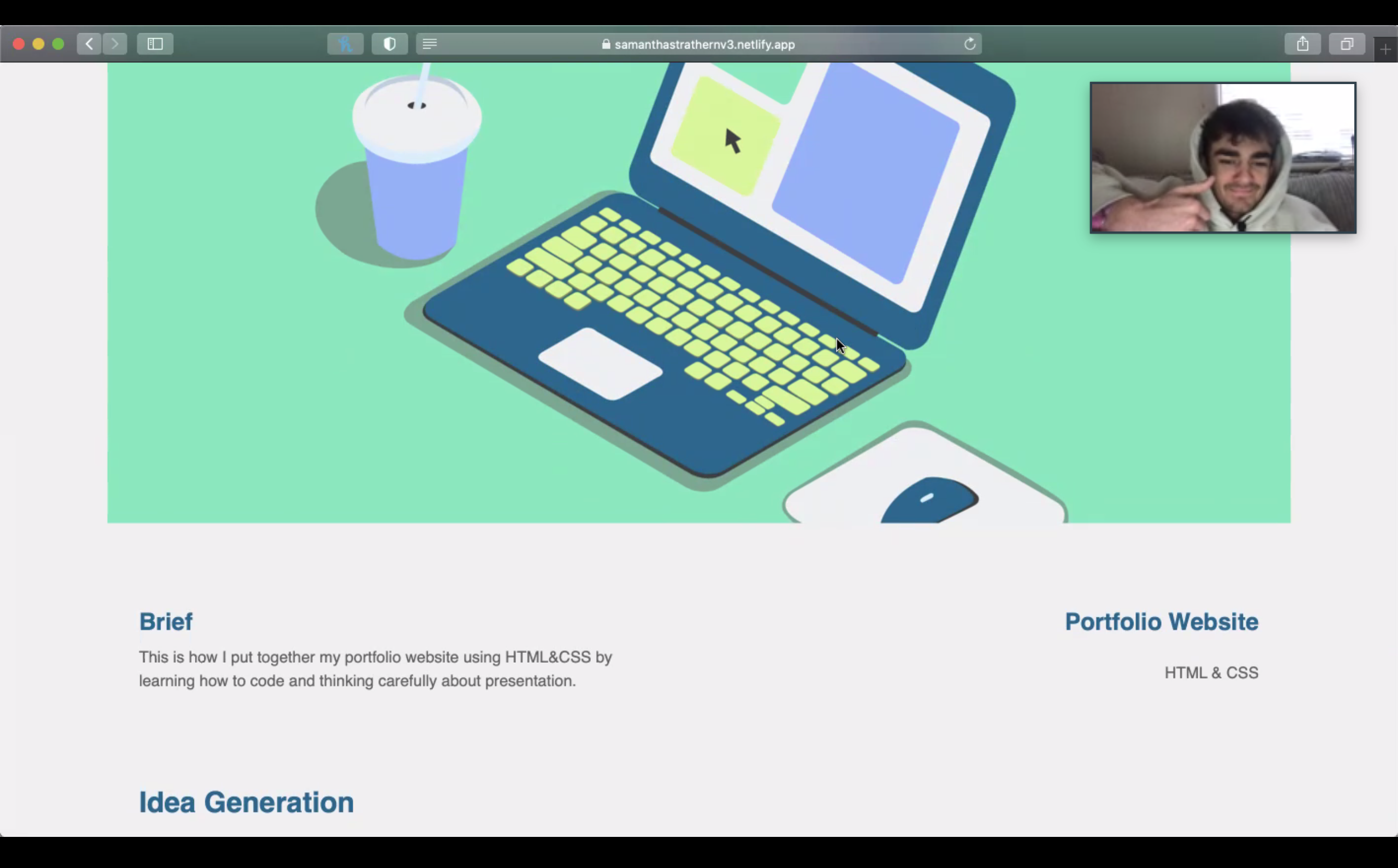
Brief
This is how I put together my portfolio website using HTML&CSS by learning how to code and thinking carefully about presentation.
Portfolio Website
HTML & CSS
Idea Generation
Wireframe and Content
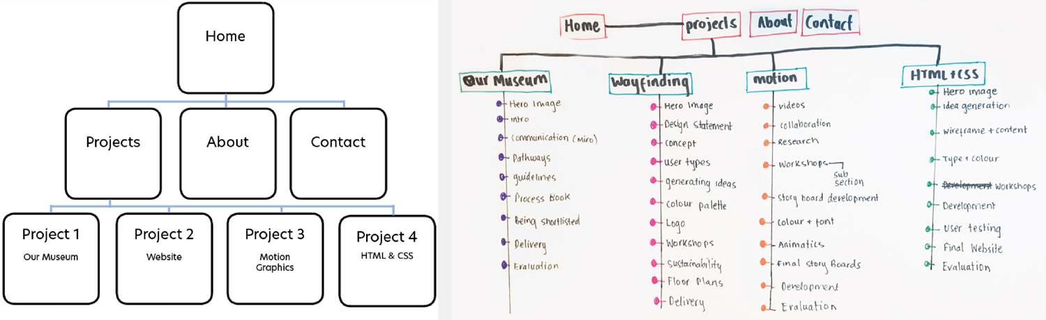
I began by drawing out the simple wireframe for my portfolio website. Before starting to get my content together i wanted to think about what content will go in which pages and in what order. This helped me when putting content into the HTML as it made it less over whelming and complicated. It also allowed me to think about and sub-navigations I'd want for workshops or development. I decided to pick four level 5 project but I will eventually add additional work I'd like to show.
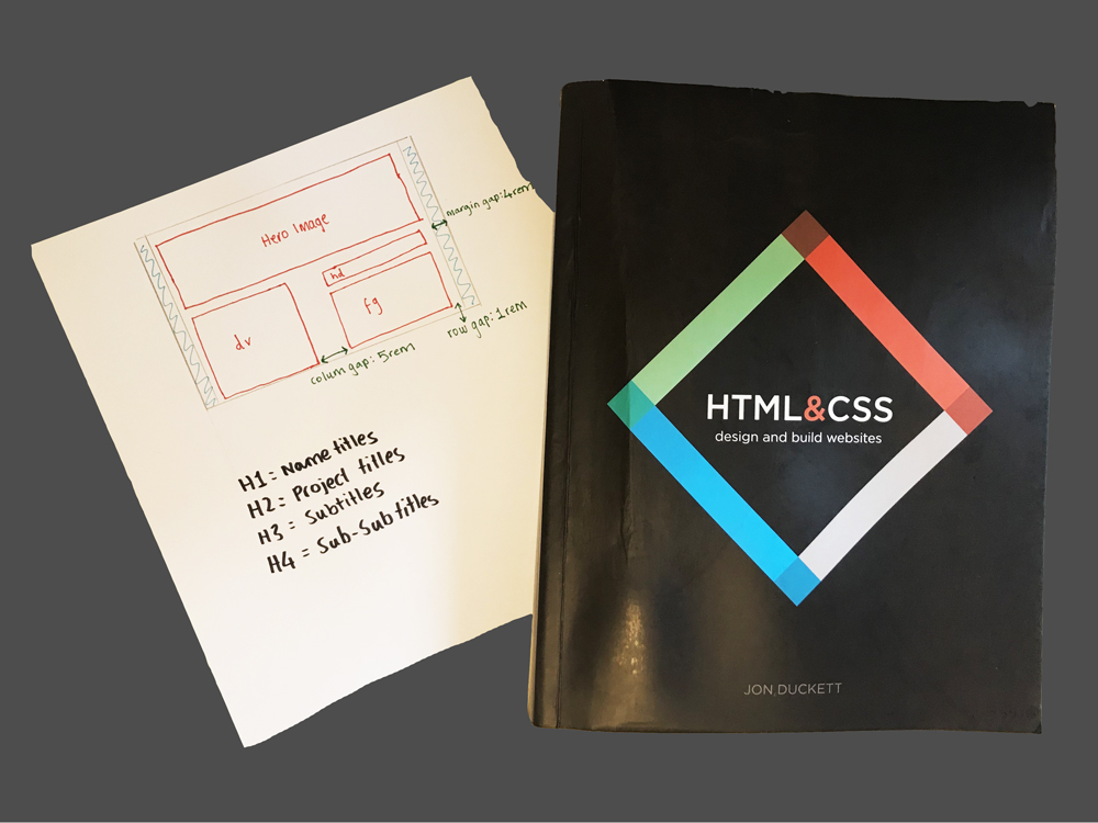
Final Layout Plan
Website Layout
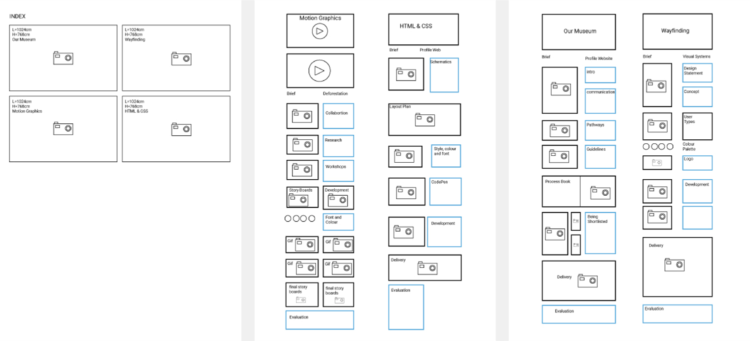
To help me code my website I created a simple mockup of where im planning to put my content. This helped me focus when I started to add my content. It helped to refer back to the layout and wireframe plans as I could refer back to it.
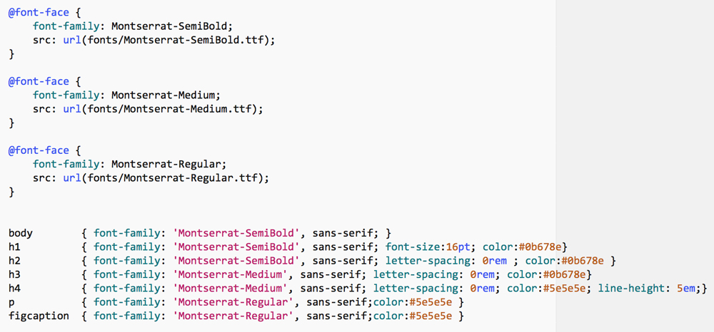
Style, Colour and Fonts
Colour
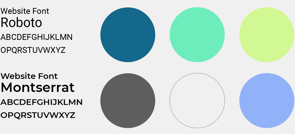
This is the colour palette I ended up picking for my website. I felt the colours looked fresh, youthful, bright and exciting which is how I view myself as a designer.
Typeface
I found these fonts where the Most legible. This was important for my website as i wanted it to be clear to most users.
Website Pages
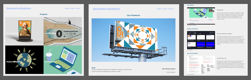
Layout
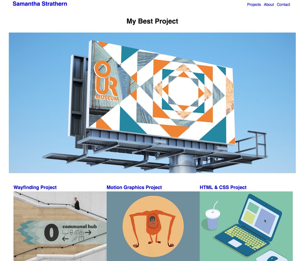
For my final layout it was important to have my images big enough. This is why I went for a simpler grid as I wanted my pictures and writing to compliment each-other.
Codepen Workshops
Learning The Basics On Codepen
Starting to learn code for the first time was overwhelming at the beginning. However, the more codepen workshops I attended and the more I played around with It the more sense It started to make. After the workshops I was confident about how to handle typography with css and html. It also helped me make sense of creating a grid for when I began to code my website.
About Me Workshop
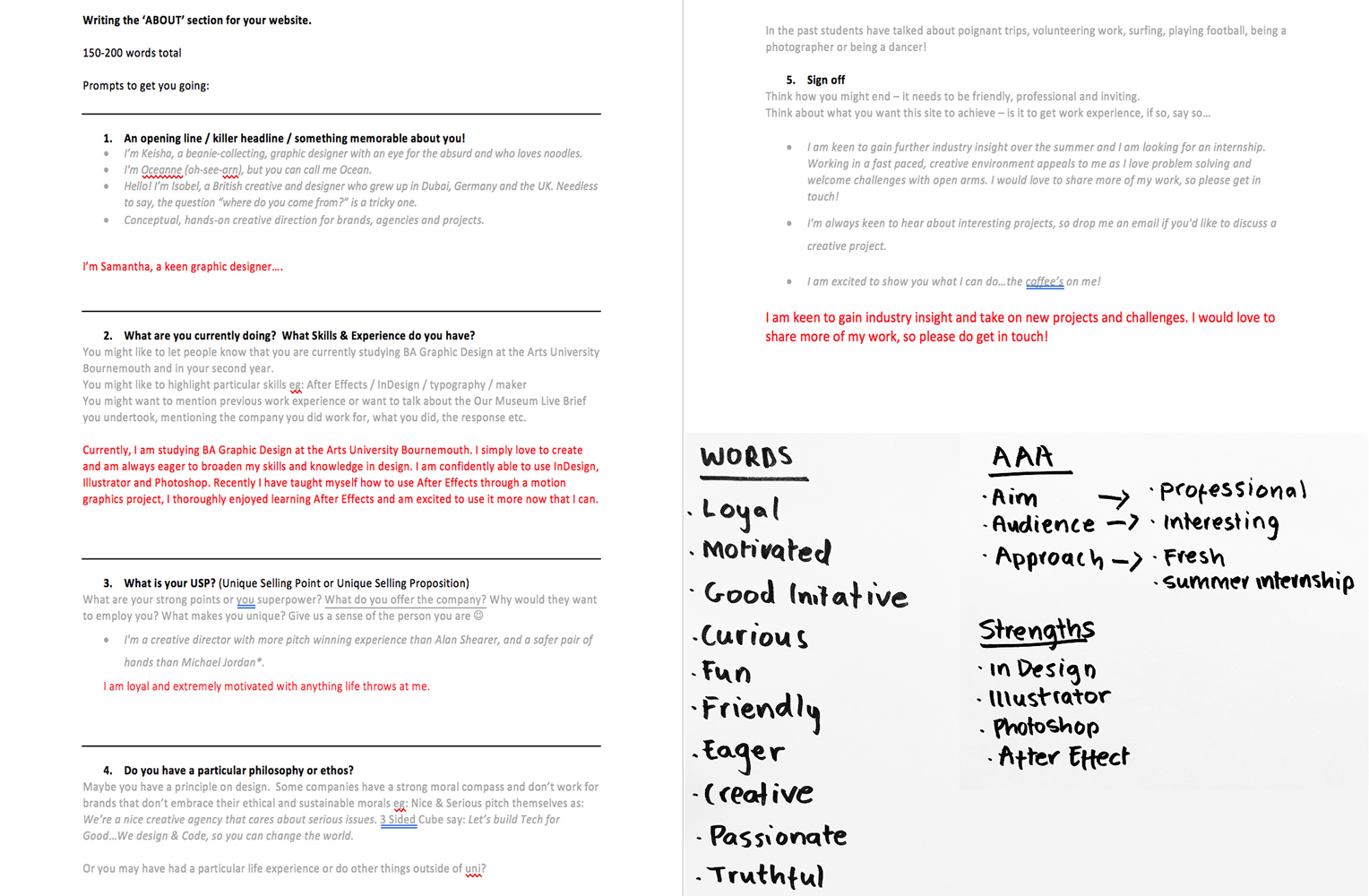
A Little Bit About Me
Initially, I found talking about myself hard but after the workshop it helped me come up with words that describe me as well as adding a personal touch of about what I enjoy.
Researching Other Peoples Portfolio Websites
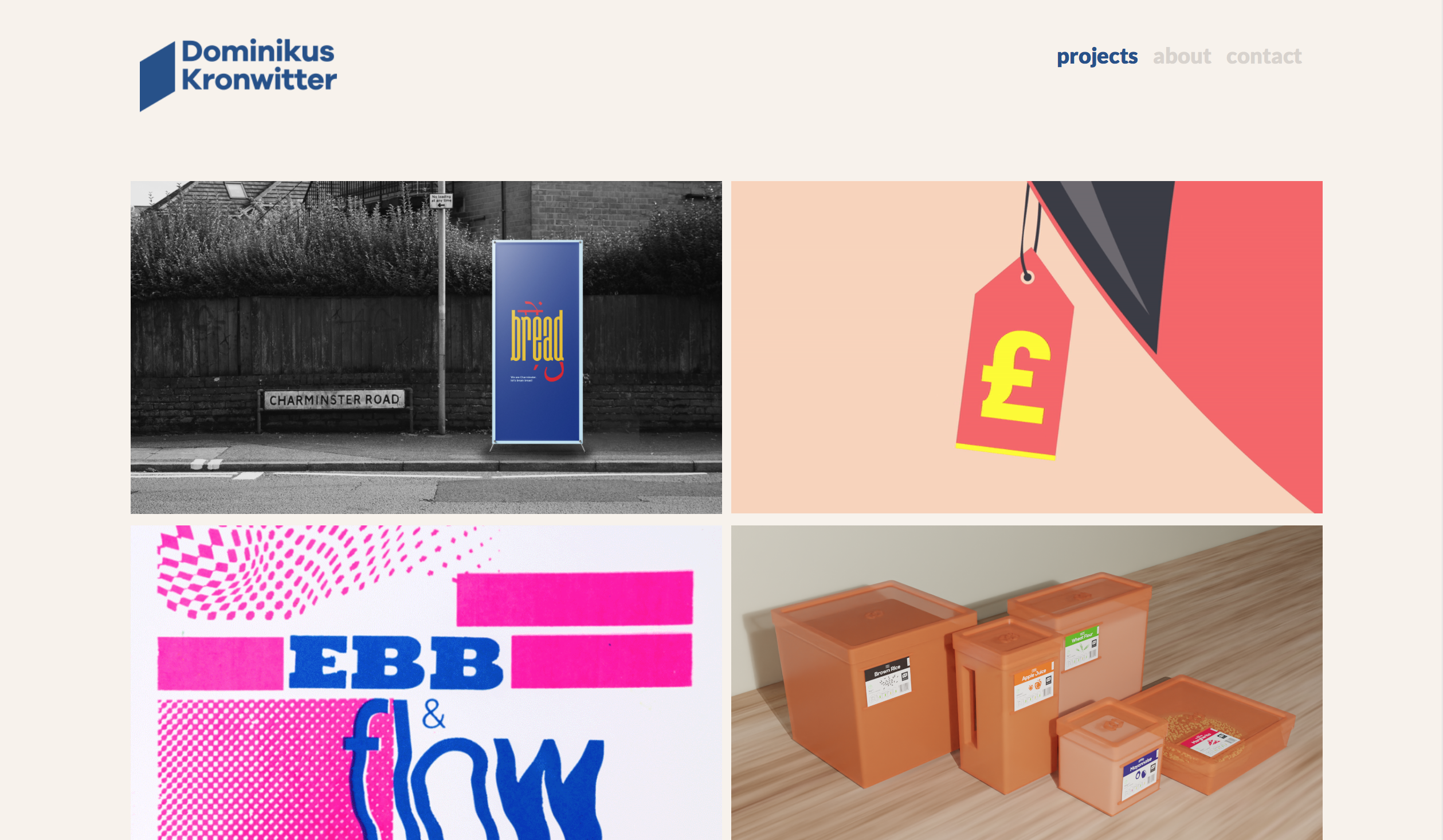
Portfolio Inspiration
I felt at this point It would be a good idea to look at previous student and designers portfolio websites. This helped me feel inspired and understand the features that make a successful website.
CSS Grid
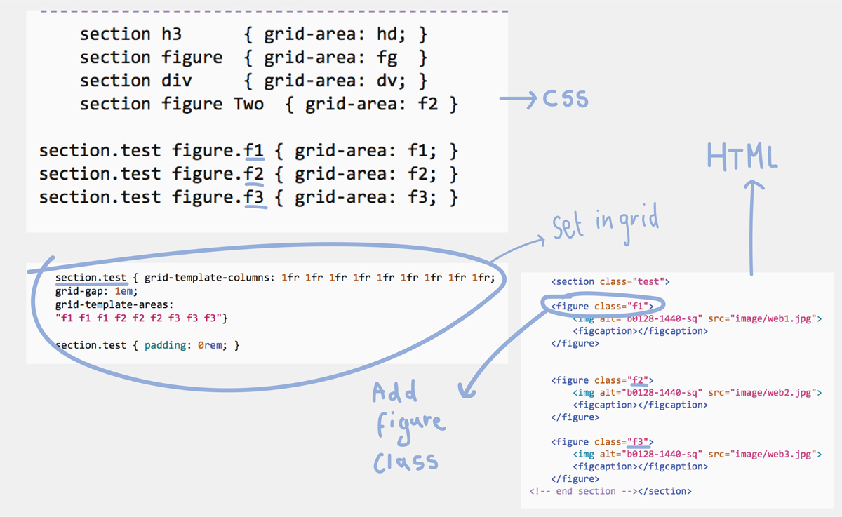
Using a Grid
Figuring out how to code my grid into css was a good start to placing my images and context in. I decided to keep my grid as simple as possible to keep the legibility at its best by not over complicating or cramming in my images.
The higher archery of my text is very important as it will help whoever views my website to navigate their way round.
Preparing My Images For The Web
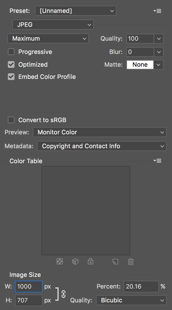
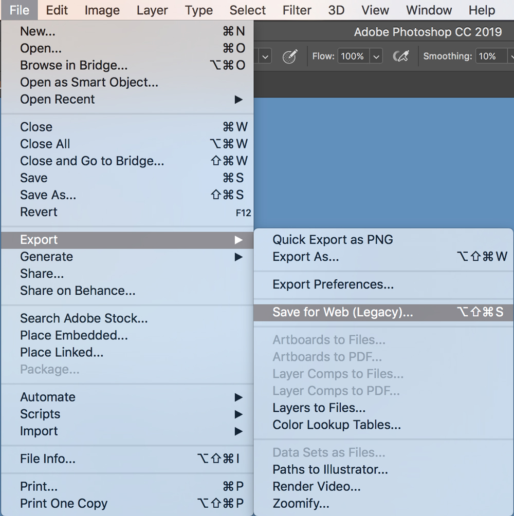
Optimising Images on Photoshop
Optimising images was important for my website. I had to make sure the file size wasn't too big so they load quick enough. I kept the image size so it didn't go over 1000 px. It was also important to keep on top of managing my files as I had a lot of images to put in my website
Design Decisions
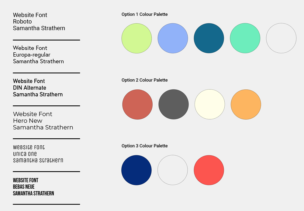
Choosing a Colour Palette and Typeface
When choosing a visual identity colour and font are really important. My main aim for the type was legibility, it was important to make sure I used a font and font sizes which people could easily read. I wanted bold colours that would work well together. I ended up going with the first colour palette as it looked most fresh, youthful and exciting as well as being clear.
User Testing
Buddy System
I found having a person that could test my website extremely helpful as Jared could see any mistakes or errors that I might have over looked. It showed me how people would navigate through my website. As well as the good feedback it was helpful to see how he found minor improvements I could make in my work.
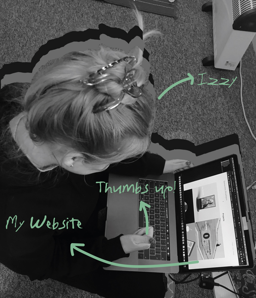
Plenty of User Testing
Living with another graphic designer was a great help as when one of us was stuck we could problem solve together. If one of us was stuck It was likely the other person could work it out. I was able to go to Izzy to user test my website to spot any errors, which there where quite a few which is why user testing was a crucial part of the process.
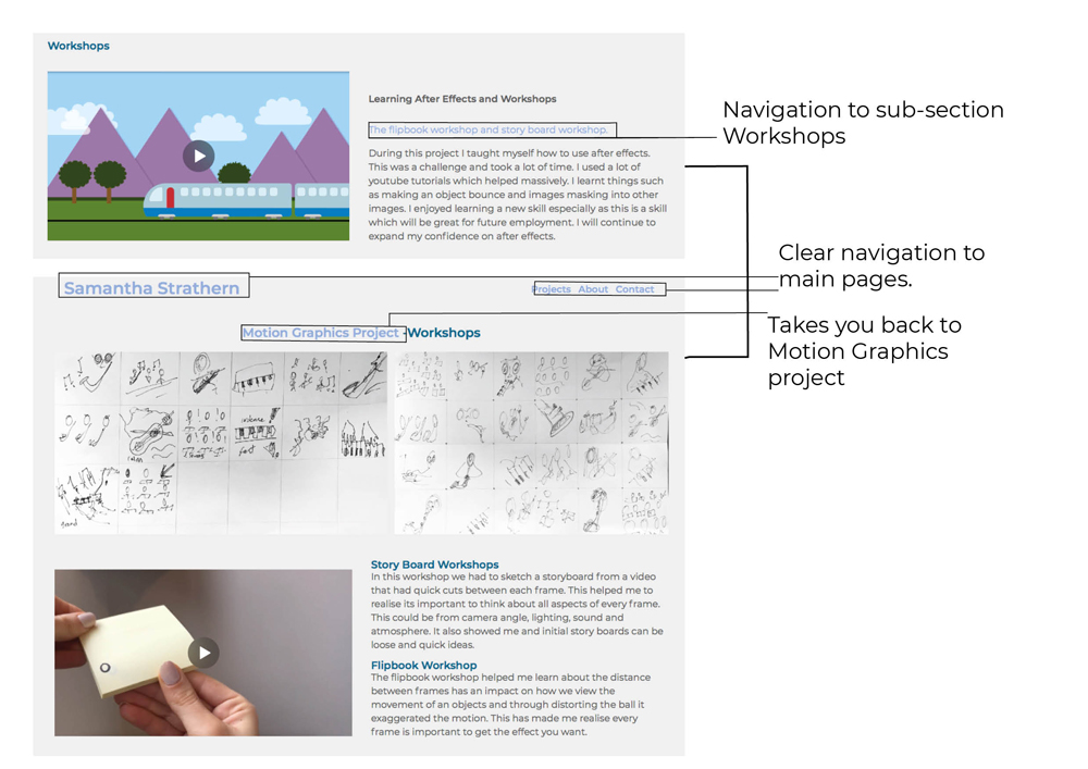
Navigation
Clear Navigation
Creating clear navigation for my site was really important. However, I didn't want to add too many different navigations as I felt It could over complicate the site.
Website Development
Changing My Index Page
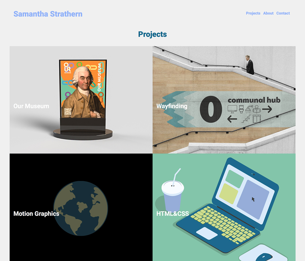
I decided to change the navigation of my index page to make it my projects page also the index. I preferred how it looked ascetically.
Background Color
Changing The Background Colour
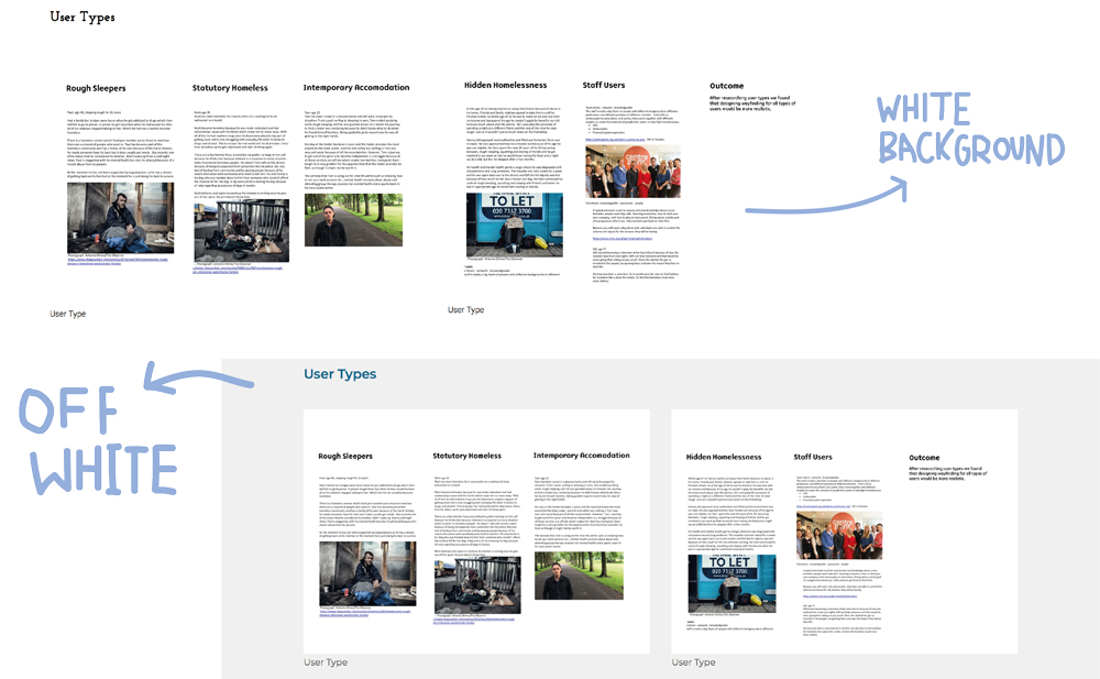
Changing the background colour helped bring my images out much more. I found having a completely white background didn't work as images would look like there floating and not in a grid
A LOT of To-Do Lists
Staying Organised
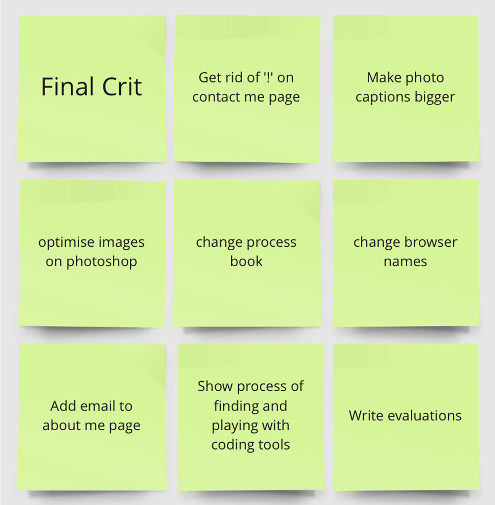
In order to keep developing my work It was important to listen to feedback and write down things that need doing. I found organisation was key to this project. It was also very satisfying when finishing a to-do list.
Finding and Trying Different Tools
Changing My Process Book
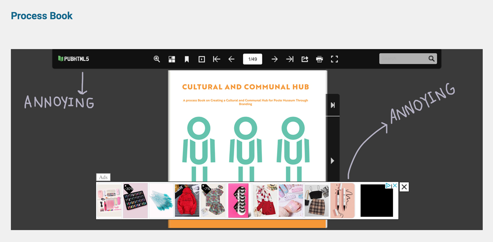
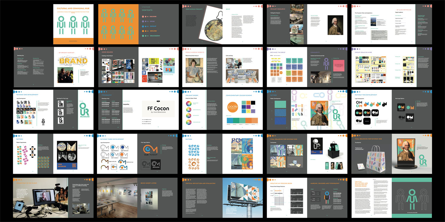
When presenting my process book on my Our Museum project I struggled with how to put it in to HTML. I found a website called 'pubhtml5', I liked how it worked, however, the adverts and the top bar ruined the professionalism of the site and I felt I should change it. I decided to present my process book by putting the spreads all in one photo.
Collapsible
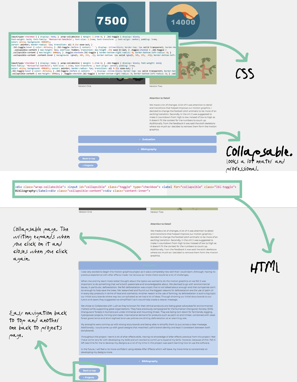
A Pure CSS Collapsible
After adding my content I wanted to look at more tools I could add into my code. I felt I needed to work on my navigation. I found the coding for this very overwhelming and there where a lot of errors at first. However, I kept playing around with It and It turned out to be very successful. The navigation going back to the projects and to the top of the page makes the navigation a lot easier for viewers of my website. I also preferred having my evaluation and bibliography collapse as they where huge chunks of text before which didn't look too ascetically pleasing on my page.
Before starting this project, I was slightly worried about how I would handle coding. I knew It was going to be a massive challenge. However, I was extremely excited to learn a new skill as it will increase my chances of an internship by having it as a skill. I knew the project would consist of a lot of problem solving which was frustrating at times but also extremely rewarding when the problems where overcome.
Having no previous knowledge of coding I found the workshops that my Graphic Design tutor Mark Osborne did where extremely helpful and made my understanding of HTML&CSS a lot clearer which was a massive relief before starting to code my website.
I found creating a clear navigation for my website challenging. However, after experimenting and finding helpful tools I was a lot more confident with the navigation of my sight. I created one sub-navigation for my workshops on motion graphics. I avoided having too many sub-sections as I felt It could make the viewer feel too over whelmed and I didn’t want to over complicate anything.
Another challenge I came across was file sizes of my images, after having my buddy and tutors navigate through my website on Netlify they pointed out my file size was way too big and needed to be optimized and reduce my files. By doing this it ensured images on my site would load a lot quicker, increasing the professionalism of my site.
I have particularly enjoyed designing my visual identity of the sight and will continue to work and adapt it as I grow as a designer. If I could go back I would have done a realistic mock-up of my website before coding as I feel this could have helped me feel less over whelmed when putting in my images and context. Although, I found creating a schematic and checklists extremely helpful.
Overall, I have enjoyed this project and I can’t wait to carry on building my website and experimenting with coding while being able to show my work to possible employers.
•Alligator.io. (2020). Implementing A Pure CSS Collapsible [online]. Available from: https://www.digitalocean.com/community/tutorials/css-collapsible.
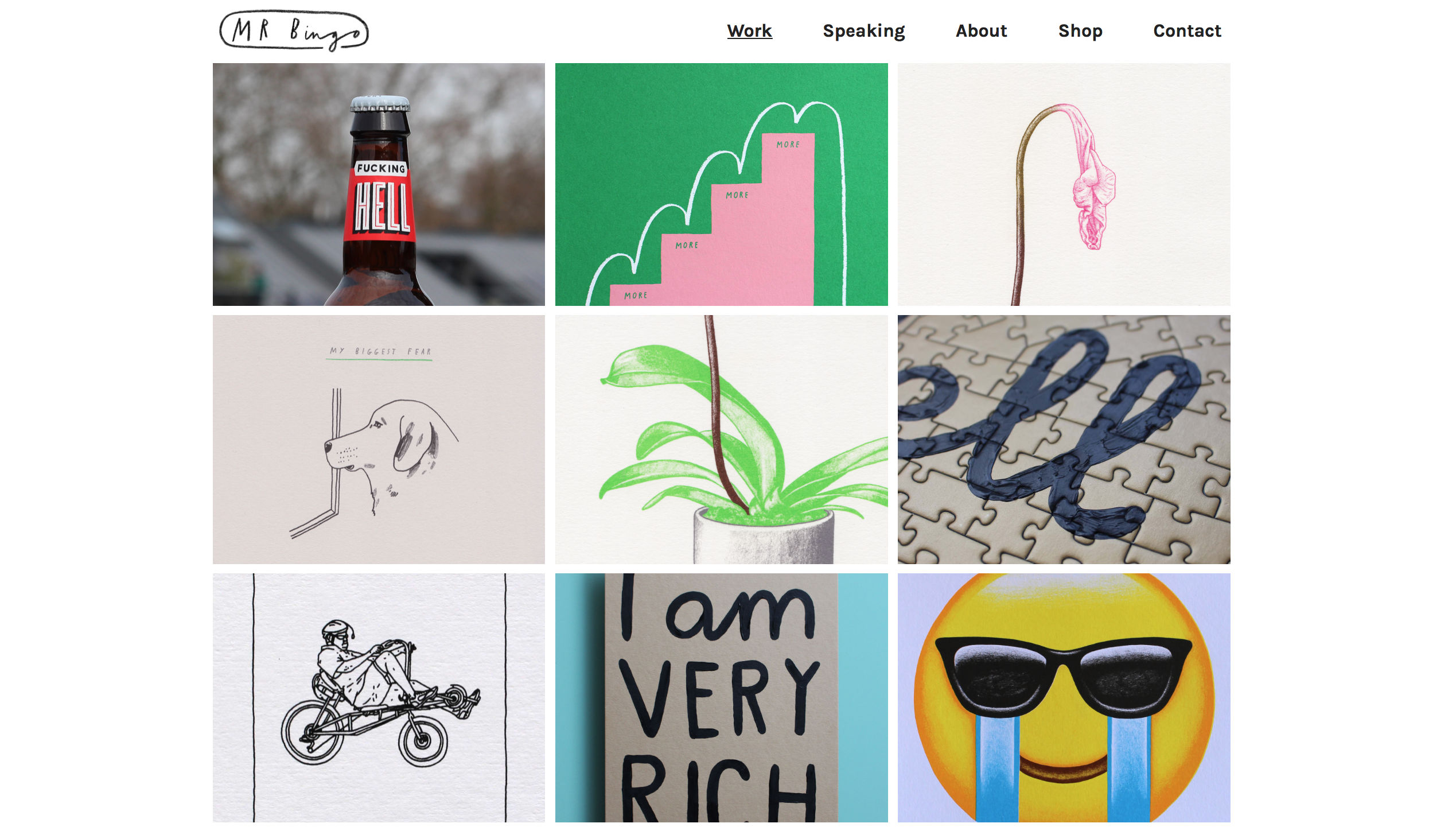
•Bingo, M. (n.d.). Mr Bingo: Artist, speaker and twat [online]. Available from: http://mr.bingo [Accessed 4 March 2021].
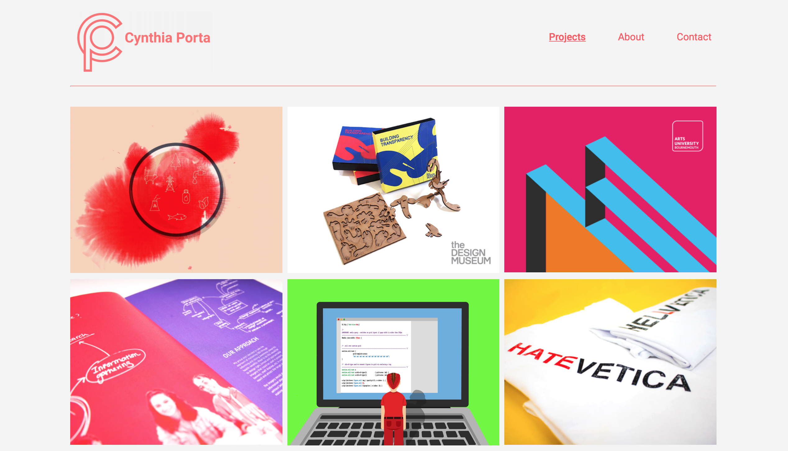
•Cynthia Porta (2020). Cynthia Porta [online]. Available from: https://cynthiaporta.co.uk/about.html [Accessed 2021].
•Dominikus Kronwitter (2020). Dominikus Kronwitter | About [online]. Available from: http://www.dominikus-kronwitter.com/about.html [Accessed 4 March 2021].
•Jon Duckett (2011). HTML and CSS: Design and Build Websites. Paperback. Wiley; 1st edition.
•pubhtml5.comAvailable from: https://pubhtml5.com (n.d.). Digital Publishing Platform & Software for Magazines,Catalogs,Brochures,FlipBook & More | PubHTML5 [online]. [Accessed 4 March 2021].